Table Of Content
Color is an essential element of branding and design. The Pantone Matching System (PMS) is a color-matching system that has revolutionized how colors are in the market.
It ensures consistency across different materials and platforms. That’s why understanding PMS can uplift your projects to a professional level if you're a designer, manufacturer, or business owner.
This blog post will share details about the Pantone matching system by explaining its advantages, disadvantages, application, and comparison with other color systems. We’ll also answer some common queries related to PMS. So, let’s start our discussion without any further ado!
What is the Pantone Matching System?
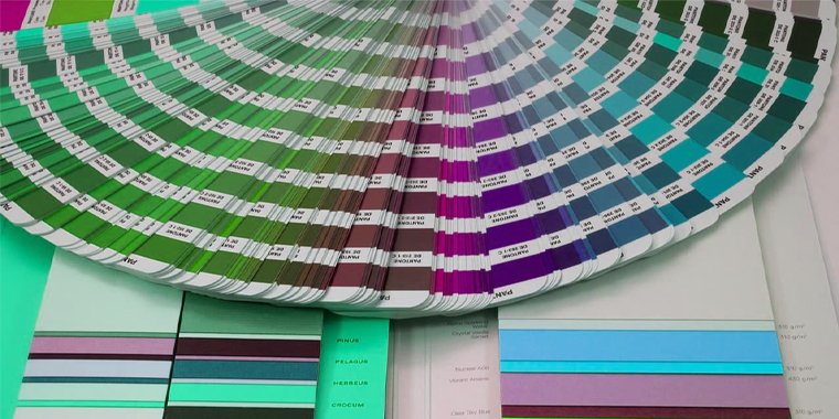
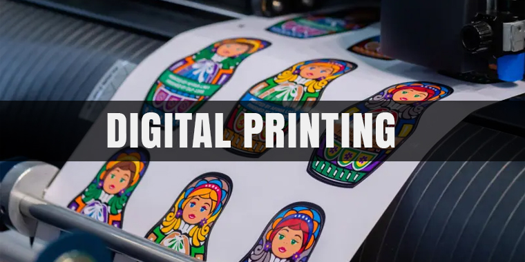
PMS stands for Pantone Matching system, which means it's the same thing. It is a color reproduction system developed in 1963 by Lawrence Herbert. It assigns unique codes to colors that are known as Pantone color codes.
These codes ensure the consistency in colors wherever they’re reproduced. Each color is identified by a number, making it easier to communicate color choices.
This system is valuable in industries where precise color matching is important. PMS eliminates the guesswork and ensures that the final product matches the original design, like for custom e-commerce packaging.
Importance of PMS in Different Industries
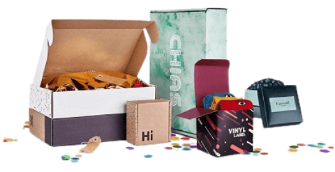
In some industries, like packaging, printing and fashion, colors play a key role in attracting customers. This also helps to reinforce brand identity. The Pantone Matching System helps to:
- Create consistent branding across product lines.
- Reproduce specific colors on different materials like plastic, cardboard, and foil.
- Design stunning graphics and logos that attract customers to your products.
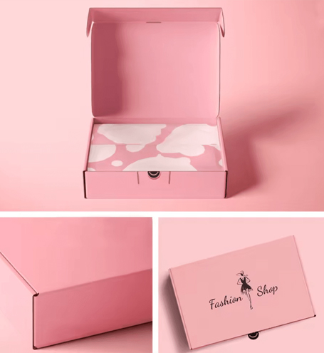
For example, premium brands use metallic shades, while environmentally friendly brands use subtle shades for sustainable packaging. This shows how PMS can adapt to various market needs.
Iconic brands like Coca-Cola use PMS to keep their signature red color consistent on their cans and cartons. This precision ensures that customers instantly recognize the brand. PMS ensures that:
- Brand colors remain consistent across various packaging materials.
- Businesses avoid costly mistakes caused by inaccurate color reproduction.
- Designs maintain a professional appearance, boosting customer trust.
Advantages and Disadvantages of PMS
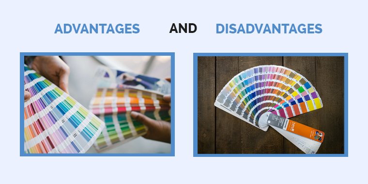
PMS offers many advantages but also has some disadvantages. Let’s discuss them:
Advantages
- Ensures exact color consistency across mediums.
- Recognized as a global standard for color matching
- Simplifies communication between designers and manufacturers.
- Works well with various materials like paper, plastic, and textiles.
- Delivers professional-quality results that meet high industry standards.
Disadvantages
- PMS books and tools can be expensive.
- Colors may vary slightly on different materials.
- Limited to predefined colors; less flexible than digital blending.
- Requires some learning for beginners to use it effectively.
- Not all printers and manufacturers support PMS.
How Does PMS Work?
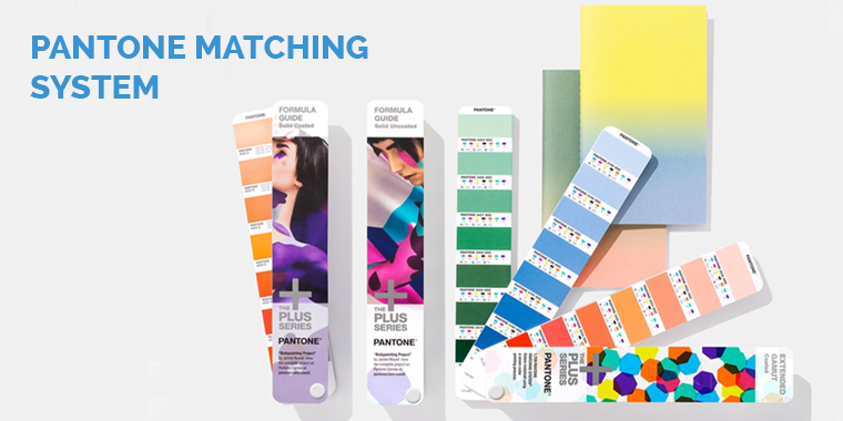
The PMS uses physical swatches and digital tools to represent colors. Designers choose a color from a PMS color chart or swatch book. They have thousands of shades. Each color has a PMS color code, which makes it easy to reference.
For example, if a designer selects "PMS 185 C" for a logo, it can be reproduced using this reference. This ensures consistency across different items, such as clothes, custom shape boxes, and magazines.
How to Find and Match the Closest Pantone Colors?
To match the closest Pantone colors for any kind of packaging or promotional materials like table tents:
- Use Pantone's official website or Pantone Connect tool to match digital colors.
- Compare a physical swatch book to printed colors for accuracy.
- Use third-party matching tools, like Adobe Photoshop, for approximation.
Comparing PMS With Other Color Systems
Let’s review the key differences of PMS with CMYK and RGB color systems:
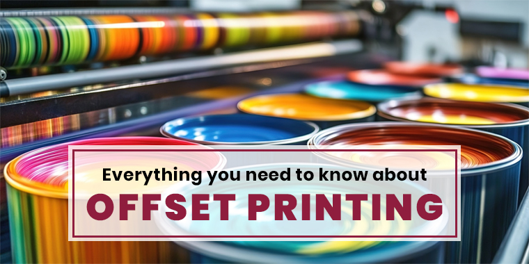
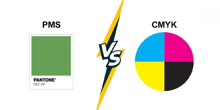
1. Pantone Vs. CMYK
CMYK is a color model used for conventional printing. It blends cyan, magenta, yellow, and ki (black) to create colors. However, CMYK can produce shade variations depending on the printer and paper type.
|
Pantone (PMS) |
CMYK |
| Offers precise, standardized colors | Produces colors by blending four inks |
| Best for branding and logos | Ideal for printing photos and gradients |
| Includes metallic and fluorescent options | Limited in specialty color reproduction |
Also Read: How CMYK Printing is Changing the Packaging Printing Trend
2. Pantone Vs. RGB
RGB is a color model used for digital screens. It blends red, green, and blue light. While RGB is great for digital projects, it doesn’t ensure accuracy when converting colors for print.
|
Pantone (PMS) |
RGB |
| Designed for physical materials | Used for digital displays |
| Provides exact color-matching | May appear differently on various screens |
| Suitable for packaging and branding | Ideal for web and app design |
Also read: Which Color Model is Used in Printed Designs?
Summing Up:
The Pantone Matching System (PMS) is a vital tool for anyone working with colors, especially in the packaging and printing industries. Its ability to standardize colors across mediums ensures that brands maintain consistency in their designs.
At Custom Designs Boxes, we utilize PMS color matching to deliver high-quality packaging solutions that are made according to the requirements of your brand. These include colored mailer boxes and custom mylar bags. Contact us today via email at sales@customdesignsboxes.com to learn how we can help elevate your packaging game in the market.
Frequently Asked Questions
We’re confident that you will love our products and service.

Abdul Waheed
With over a decade of experience in the printing and packaging industry, I’ve dedicated my career to helping brands reshape their identity with creative, sustainable, and cost-effective packaging solutions. Being the CEO of Custom Designs Boxes, my mission is simple: to balance innovation with affordability so businesses of every scale can enjoy premium packaging truly reflecting their vision. When I’m not strategizing for the next big packaging trend, you’ll find me exploring design inspirations, mentoring my team, and building lasting relationships with clients.