Table Of Content
“Which color model is actually put to use for printed designs?” is a matter that is bound to arise if you work in visual arts, packaging, branding, or print production. The quick answer is CMYK, but there is much more to the narrative.
Today's printed output lies at the nexus of digital design software, color science, printing techniques, material choice, and expert color management. Whether you're printing a product label, banner, business card, or makeup box, understanding how color models function and how they transfer from the display to the final print is significant. It will decide how your final product will appear: bland and dull or rich and brand-accurate.
From standard color models to print procedures, calibration, spot colors, and prepress workflows, let's uncover all you need to know.
The Color Models Every Designer Should Know
Because different mediums produce colors in different ways, there are various systems. A printed art depends on ink bouncing light back to the viewer, whereas a screen transmits light. Because of this basic distinction, designing in the incorrect color mode can drastically alter the finished product.
RGB: The World of Screens
Digital displays' native colour model is RGB (red, green, and blue). RGB pixels, which emit light in various quantities to produce millions of hues, are the foundation of your laptop, phone, tablet, and television.
It has been additive, meaning that you get closer to white the more color you add. Besides, designers typically start using RGB because:
- Compared to CMYK software, it offers a greater color spectrum.
- It's perfect for digital illustrations, mockups, and ideas.
However, leaving your file in RGB when sending designs to print is a mistake. It's possible that CMYK ink misses the intense neon blues, rich purples, and sizzling reds that appear stunning on screen. The print shop can convert them if it is not done in advance, and the outcome might not be what you were hoping for.
Rule: If it’s meant for print, convert to CMYK before finalizing art.
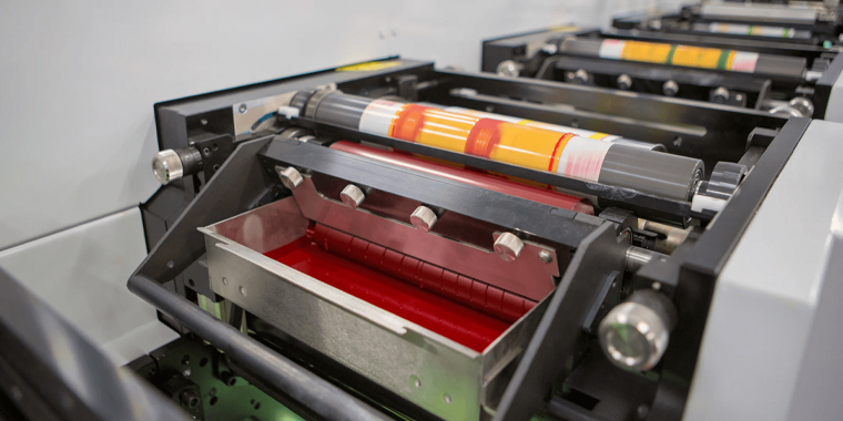
CMYK: The Printing Standard
This is the model that does the heavy lifting in commercial printing, including magazines, boxes, postcards, leaflets, and menus. Moreover, it serves as the foundation for digital printing, offset printing, and the majority of packaging applications.
CMYK stands for Cyan, Magenta, Yellow, Key (Black). Because CMYK is subtractive, the output gets darker the more color you add. Printers may replicate thousands of color changes by stacking tiny dots of these four inks.
*“Key” means the plate that carries all details and typically aligns the other inks.
CMYK is the color model you should prepare the piece of art in if it will be used on paper, cardboard, corrugated packaging, stickers, or product boxes.
Tip: CMYK works best when viewed on a calibrated screen with 300 DPI artwork.
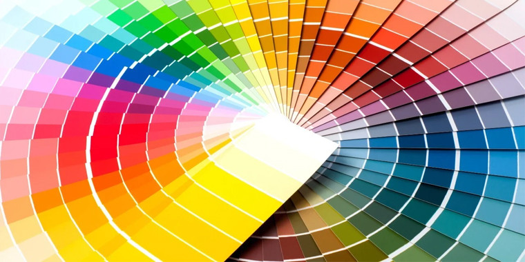
Pantone: For Absolute Color Accuracy
Pantone is a color language rather than a color model. Each swatch is given an individual identifier by the Pantone Matching System (PMS), facilitating exact color communication between printers and brands worldwide.
Pantone works best when:
- Logos need to be consistent throughout merchandise, no matter the printer or the setting of work.
- Pallets need to be matched efficiently with unusual materials.
- Metallic, neon, or specialty inks are demanded.
- Variations in colour are not permissible.
Pantone spot colors are the preferred choice when printing items that are strictly on-brand, such as luxury packaging, business stationery, cosmetic labels, apparel tags, or branded merchandise.
Use Cases: Pantone is used by multinational companies like Coca-Cola and Tiffany to maintain the consistency of their iconic reds and blues around the globe.
Spot Colors vs. Process Colors | A Quick Comparison
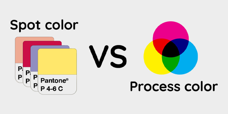
Process colour printing (CMYK) and spot colour printing (Pantone and comparable systems) are the two main methods used in professional printing. Each has a distinct function, costs, and aesthetic benefits.
Process Colors
By layering tiny dots in varying densities, process printing employs the four conventional inks (Cyan, Magenta, Yellow, and Black) to produce a broad range of colors. This approach is very effective and adaptable for:
- Full-color artwork, such as images, sketches, and gradients.
- Large manufacturing runs with a reduced cost per unit.
- Designs with a variety of colors, as extra hues are produced by blending ink rather than using different plates.
Even though CMYK has a great range, without the right color profiles and calibration, accuracy may differ between printers or materials.
Spot Colors
Spot colors are pre-mixed inks that are generated one at a time and are frequently determined by systems such as Pantone (PMS). The ink is applied as a pure, consistent tone rather than blending cyan, magenta, yellow, and black. This method works well for:
- Accurate brand tone matching that guarantees uniformity in all print and packaging items
- Single-color labels or minimalistic branding are examples of limited-color patterns.
- Metallics, neons, pastels, varnishes, and textured finishes are examples of specialty inks.
It is preferable for patterns with few, deliberate hues because each spot color requires a separate printing plate, which adds expenses as more colors are utilised.
Printing Processes and Their Relationship with Color
The printing process itself has an impact on how colors show up in print, in addition to the ink. The ultimate look, consistency, and cost of printing are all affected by how each technique handles ink.
|
Printing Method |
How It Works | Best For | Key Advantages |
| Offset Printing | Before the design reaches the surface to be printed, it is divided into CMYK plates, moved to aluminium plates, and then offset to a rubber blanket. | Folding cartons, rigid boxes, posters, books, and luxury packaging. | Delivers excellent detail and rich, accurate hues; is very economical for large-scale orders; and yields consistent results over hundreds of prints. |
| Digital Printing | Functions similarly to laser printing, utilizing CMYK (and occasionally expanded color sets like orange, violet, or green); no plates are needed. | On-demand projects, variable data printing, holiday designs, small to medium print runs, and short-run boxes. | Quick turnaround, affordable for small orders, perfect for customisation, and simple setup. |
| Screen Printing | Solid, opaque layers of shades are created by pushing ink through a fine mesh stencil onto the material. | Fabric, plastics, metal, wood, and specialty packaging surfaces. It can also be applied to thicker inks (example: UV, tactile varnish, etc.). | Bright, richly saturated tones with high coverage, long-lasting ink layers, and perfect for textured graphics or finishes (albeit slower than offset or digital). |
The Role of Graphic Design Software
Printing is only one aspect of color management; software is another key component.
Adobe Illustrator
Illustrator frequently serves as the primary option for vector artwork, packaging, and branding. It provides:
- Workspace in native CMYK
- Pantone collection with built-in granularity over spot and process colors
- Vector scaling and clean typography
It is therefore suited for label artwork, dielines, box designs, and logos.
Adobe Photoshop
Photoshop manages photos, texturing, retouching, and photographic aspects. CMYK processes are supported, but designers have to keep in mind to change color modes before final export; if not, the change might occur too late in the process.
CorelDRAW
Fast layout tools, CMYK workflows, and spot color support make CorelDRAW a favorite in several printing industries. It is most commonly used in screen printing and wide-format printing.
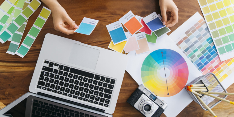
Color Calibration and Profiles; Keeping Colors Honest
The client may see a lime shade, the designer may see a bright green on their screen, and the printer will ultimately produce a boring olive. Color calibration can help with it! After all, it guarantees:
- The monitor shows actual, quantifiable hue.
- The design software is aware of the color capability of the printer.
- The end printed result is accurately represented in the digital files.
Device color interpretation is determined by color profiles, which are often ICC profiles. A lot of printers offer free profiles based on their materials, inks, and equipment. Your design environment displays an approximate representation of the finished product when it is picked in your Adobe program.
A Look Into Color Management Systems (CMS)
The foundation of reliable and accurate color reproduction in the print and design processes is a Color Management System (CMS). It functions as a digital translator, standardizing the interpretation of hues across various media and devices. A CMS makes sure that the image that you see on a computer is similar to what comes out of the printer, considering every device shows and deals with pigment differently.
How CMS Works
A CMS communicates between:
- RGB color displays on monitors.
- Cameras and scanners that use their internal color space to take pictures.
- Printers that use spot or CMYK inks to produce colourful prints.
- Shades are first developed and assigned values in design software, such as Adobe Illustrator, Photoshop, or CorelDRAW.
Every device has an ICC color profile that describes how it perceives, displays, and replicates a hue. These profiles are used by the CMS to guarantee uniformity throughout the production process.
Why CMS Matters
Without a CMS, each device interprets color in its own way:
- On some printers, blues can change to purple, while a brilliant red on the display may appear dull or worn out.
- Consistency in brand themes is lost within production runs and materials.
With a CMS in place:
- A CMYK red looks the same in Illustrator, on a calibrated display, and on a printed 300-gsm coated sheet
- Printers are able to continually output exact tones.
- Whether printed digitally, offset, or in numerous facilities, packaging guarantees brand integrity.
Prepress Workflow – Where Printing Success Is Decided
Prepress refers to everything that happens before ink hits the paper:
- RGB to CMYK conversion
- Testing of spot colour
- Knockout and overlay inspections
- Set up of bleed and crop lines
- Trapping (overlapping colors to avoid gaps)
- Proofing
- Font embedding or outlining
- Image resolution checks
- Plate output for offset jobs
The majority of print catastrophes are caused by improper prepress. Before approving a file, professional print companies check it for mismatched profiles, inaccurate spot conversions, missing typefaces, and unexpected RGB values.
Final Thoughts
So, which color model is used in printed designs? CMYK sits at the center of the print universe, but it doesn’t stand alone. If you’re designing for print, always work collaboratively with your print provider, request proofing when color accuracy matters, and start each project with CMYK or Pantone in mind. On the one hand, understanding color models enables you to make informed printing choices that look great on both screen and paper. On the other hand, when designers understand how all these pieces fit together, the result is print that looks as good in your hands as it did in your imagination.
At Custom Design Boxes, our experts guide you in selecting the best model and navigate the differences between RGB, PMS, and CMYK smartly. Think of it as fine-tuning your colors to achieve vibrant, memorable visuals for your packaging. You can avail other perks, such as free shipping, sample kits, no-cost design assistance, bulk order discounts, fast turnaround, low MOQs, and the list continues. Contact us right now to get a consultation and enjoy endless packaging benefits.

Abdul Waheed
With over a decade of experience in the printing and packaging industry, I’ve dedicated my career to helping brands reshape their identity with creative, sustainable, and cost-effective packaging solutions. Being the CEO of Custom Designs Boxes, my mission is simple: to balance innovation with affordability so businesses of every scale can enjoy premium packaging truly reflecting their vision. When I’m not strategizing for the next big packaging trend, you’ll find me exploring design inspirations, mentoring my team, and building lasting relationships with clients.